Dashboard Layout
Now that we've got designs for our new dashboards, let's go and build the Grid for the layout of this page, using Coral.
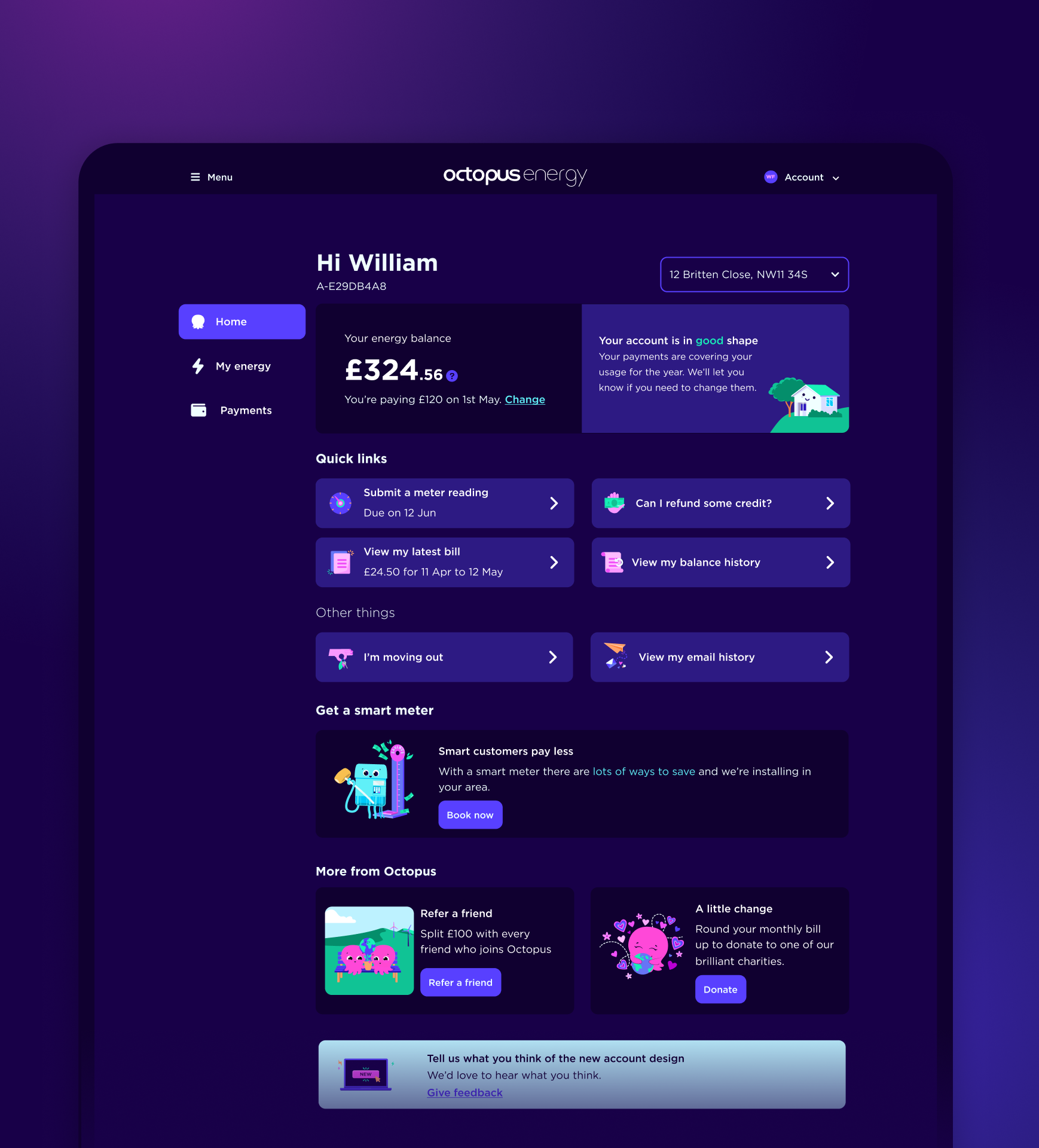
Example of a dashboard layout we'd like to achieve:
Header
Address
Nav
Main 1
Main 2
The code
We've used Grid template areas for this layout, so that we can establish what section of the dashboard should go where inside the Grid, using a name for that area.
We've named the template areas: header, address, nav, main.
As you can see below we also deal with responsive layout here too. We move the sections based on the screen width.
<Grid
  gap="md"
  templateColumns="repeat(4, 1fr)"
  templateAreas={
      "header header header header"
      "address address address address"
      "main main main main"
  }
  sm={{
      templateColumns: 'repeat(4, 1fr)',
      templateAreas:
          "header header address address"
          "main main main main",
  }}
  md={{
      templateColumns: 'repeat(4, 1fr)',
      templateAreas:
          "header header address address"
          "main main main main",
  }}
  lg={{
      templateColumns: '220px 1fr 1fr 1fr',
      templateAreas:
          "header header header address"
          "nav main main main",
  }}
>
  <GridItem
      area="header"
      colStart={1}
      colSpan={4}
      sm={{ colStart: 1, colSpan: 2 }}
      lg={{ colStart: 2, colSpan: 2 }}
  >
      <Card borderless theme="mid">
          <Typography>Header</Typography>
      </Card>
  </GridItem>

  <GridItem area="address">
      <Card borderless theme="mid">
          <Typography>Address</Typography>
      </Card>
  </GridItem>

  <GridItem area="nav">
      <Card borderless theme="mid">
          <Typography>Nav</Typography>
      </Card>
  </GridItem>

  <GridItem area="main">
      <Card fullWidth borderless theme="mid">
          <Grid
              gap="md"
              templateColumns="repeat(2, 1fr)"
              templateRows="repeat(auto-fill, 1fr)"
          >
              <GridItem>
                  <Card
                      fullWidth
                      borderless
                      theme="midLight"
                  >
                      <Typography>Main 1</Typography>
                  </Card>
              </GridItem>
              <GridItem>
                  <Card
                      fullWidth
                      borderless
                      theme="midLight"
                  >
                      <Typography>Main 2</Typography>
                  </Card>
              </GridItem>
          </Grid>
      </Card>
  </GridItem>
</Grid>
Please feel free to use this Grid for your new Dashboard layout and let the Coral team know how you get on!